
Medical evidence platform
uMed
A site for a platform that runs prospective research at speed — built so the whole team can edit it without breaking the layouts, and so it loads quickly for the clinicians and partners reading it.
01WordPress
Editable by everyone, breakable by no one
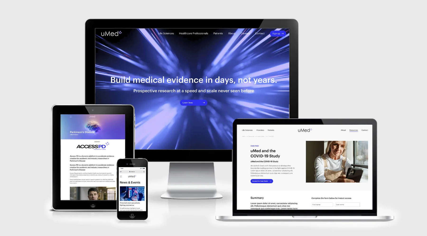
The brief was a site the team could keep current themselves. Several people needed publishing access, which is usually the moment layouts start drifting, so the build draws a hard line: content is open to edit, structure is not. Pages are composed from fixed blocks, so a new study or registry goes up without anyone having to touch the design.
02Studies & registries
One system, many studies
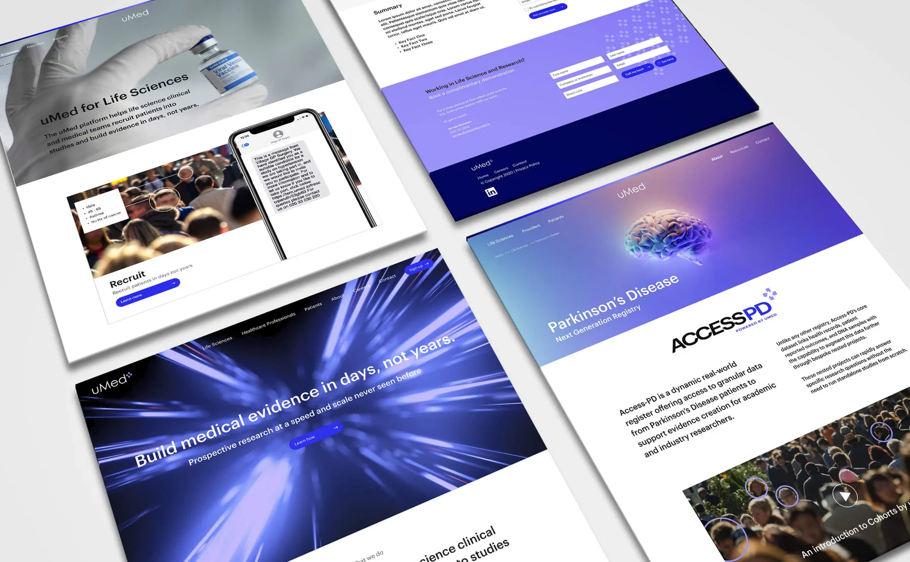
Individual programmes — disease registries, recruitment pages, condition-specific studies — each need their own pages without becoming their own microsites. They run on the same components and the same navigation, so the estate stays coherent as studies are added.
03Speed
Quick to open, quick to read
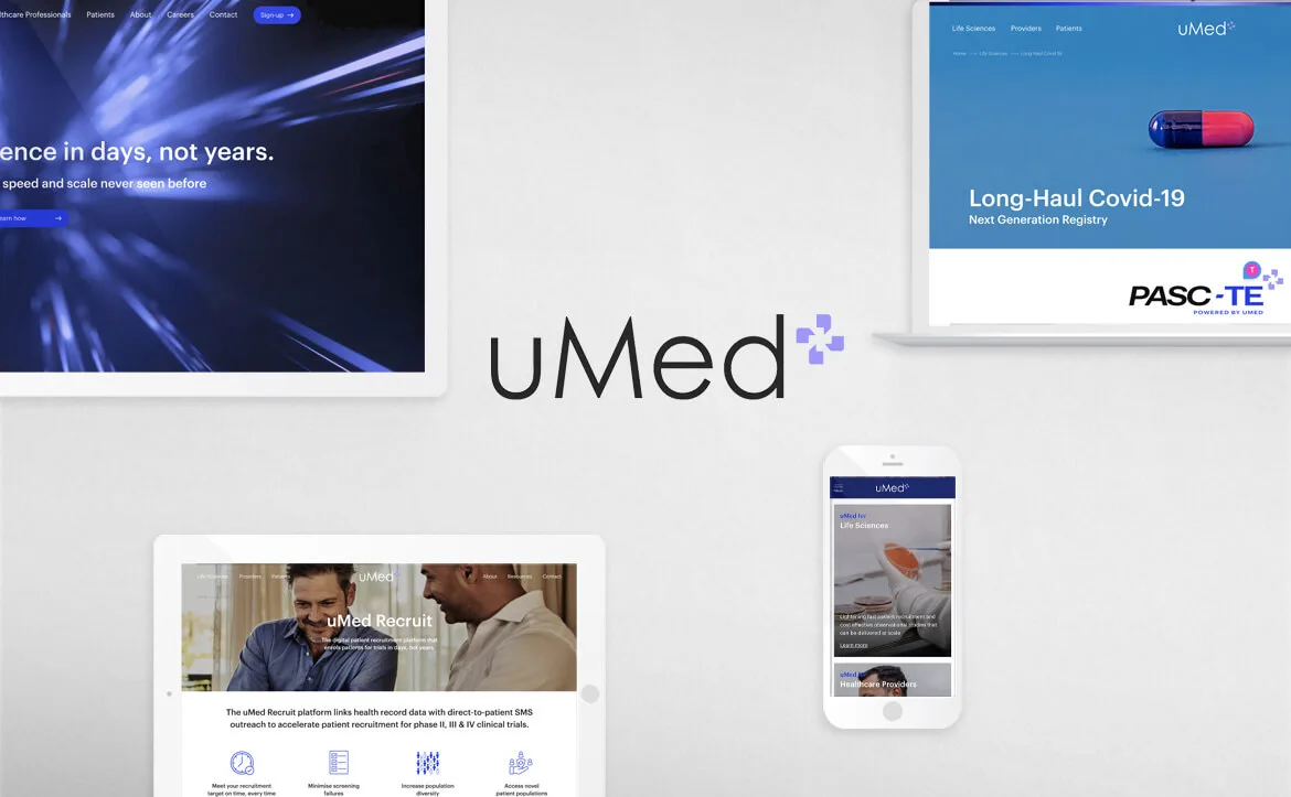
Speed was treated as part of the design rather than a pass at the end. The navigation is kept plain and the pages are kept light, so the site opens quickly on a hospital connection as readily as a fast one.
Next
Back to all work [email protected]